Tuesday, January 29, 2013

Sonification Research

Theoretical research on sonification has been conducted during the last weeks. Papers from various ICAD conferences, as well as other scientific papers with related topics have been examined.

Examined papers for research where among others:

Taxonomy and Definitions for Sonification and Auditory Display by Thomas Hermann [PDF]

ABSTRACT
Sonification is still a relatively young research field and many terms such as sonification, auditory display, auralization, audification have been used without a precise definition. Recent developments such as the introduction of Model-Based Sonification, the establishment of interactive sonification and the increased interest in sonification from arts have raised the need to revisit the definitions in order to move towards a clearer terminology. This paper introduces a new definition for sonification and auditory display that emphasizes the necessary and sufficient conditions for organized sound to be called sonification. It furthermore suggests a taxonomy, and discusses the relation between visualization and sonification. A hierarchy of closed-loop interactions is furthermore introduced. This paper aims to initiate vivid discussion  towards the establishment of a deeper theory of sonification and auditory display.


An Interface and Framework Design for Interactive Aesthetic Sonification by Beilharz Kirsty and Ferguson Samuel [PDF]

ABSTRACT
This paper describes the interface design of our AeSon (Aesthetic Sonification) Toolkit motivated by user-centred customisation of the aesthetic representation and scope of the data. The interface design is developed from 3 premises that distinguish our approach from more ubiquitous sonification methodologies. Firstly, we prioritise  interaction both from the perspective of changing scale, scope and presentation of the data and the user's ability to reconfigure spatial panning, modality, pitch distribution, critical thresholds and granularity of data examined. The user, for the majority of parameters, determines their own listening experience for real-time data sonification, even to the extent that the interface can be used for live data-driven performance, as well as traditional information analysis and examination. Secondly, we have explored the theories of Tufte, Fry and other visualization and information design experts to find ways in which principles that are successful in the field of information visualization may be translated  to the domain of sonification. Thirdly, we prioritise aesthetic variables and controls in the interface, derived from musical practice, aesthetics in information design and responses to experimental user evaluations to inform the design of the sounds and display. In addition to using notions of meter, beat, key or modality and emphasis drawn from music, we draw on our experiments that evaluated the effects of spatial separation
in multivariate data presentations.


Towards an Auditory Representation of Complexity by Joachim Goßmann [PDF]

ABSTRACT 
In applications of sonification, the information inferred by the sonification strategy applied often supersedes the amount of information which can be retrieved by the ear about the object of sonification. This paper focuses on the representation of complex geometric formation through sound, drawing on the development of an interactive installation sonifying escape time fractals as an example. The terms “auditory emergence and formation” are introduced and an attempt is made to interpret them for music composition, data display and information theory. The example application,. “Audio Fraktal”, is a public installation in the permanent exhibition of the Museum for Media Art at ZKM, Karlsruhe. The design of the audiovisual display system that allows the shared experience of interactive spatial auditory formation is described. The work was produced by the author at the Institute for Music and Acoustics at ZKM, Karlsruhe.  


Methods for Visual Mining of Data in Virtual Reality by Henrik R. Nagel, Erik Granum, and Peter Musaeus [PDF]

ABSTRACT
Recent advances in technology have made it possible to use 3-D Virtual Reality for Visual Data Mining. This paper presents a modular system architecture with a series of tools for explorative analysis of large data sets in Virtual Reality. A 3-D Scatter Plot tool is extended to become an "Object Property Space", where data records are visualized as objects with as many statistical variables as possible represented as object properties like shape, color, etc. A working hypothesis is that the free and real-time navigation of the observer in the immersive virtual space will support the chances of nding interesting data structures and relationships. The system is now ready to be used for experiments to validate the hypothesis.


Listen to your Data: Model-Based Sonification for Data Analysis by T. Hermann and H. Ritter [PDF]

ABSTRACT
Sonification is the use of non-speech audio to convey information. We are developing tools for interactive data exploration, which make use of sonification for data presentation. In this paper, model-based sonification is presented as a concept to design auditory displays. Two designs are described: (1) particle trajectories in a “data potential” is a sonification model to reveal information about the clustering of vectorial data and (2) “data-sonograms” is a sonification for data from a classification problem to reveal information about the mixing of distinct classes.

Resulting insights and ideas will be summarized during the following days.


References


Beilharz, K. and Ferguson, S. (2009) An Interface and Framework Design for Interactive Aesthetic Sonification. Copenhagen: International Conference for Auditory Display.
Goßmann, J. (2005) Towards an Auditory Representation of Complexity. Limerick, Ireland: International Conference for Auditory Display.
Hermann, T. (2008) Taxonomy and Definitions for Sonification and Auditory Display. Paris: International Conference for Auditory Display.
Hermann, T. and Ritter, H. (n.d.) Listen to your Data: Model-Based Sonification for Data Analysis. Bielefeld: Department of Computer Science University of Bielefeld.
Nagel, H. et al. (n.d.) Methods for Visual Mining of Data in Virtual Reality. Aalborg, Denmark: Lab. of Computer Vision and Media Technology, Aalborg University, Denmark.

Monday, December 17, 2012

Unity & XML

Besides all the conceptual research, first technical approaches are made on how to work with massive data sets. To get started, an XML file from worldbank.org  was imported and briefly visualized in a Unity project. 


The programming language used is C# with the use of the XMLReader Class, based on the examples from this very helpful documentation on C# Corner:    => 'Reading and writing XML in C#'

Wednesday, December 12, 2012

Hans Rossling


Famous medical doctor Hans Rossling always advertises the public availability for the massively collected data around the world by different public organizations. Moving interactive data maps showing and explaining global health issues are Rossling's typical way to present data and his knowledge, giving incredible insights in global developments and how different global factors, such as the average health or the welfare in certain countries are extremely related to each other.
He co-founded the project Gapminder.org/ targeting to increase the availability of collected data around the world to the general public.

Gapminder is a non-profit foundation based in Stockholm. Our goal is to replace devastating myths with a fact-based worldview. Our method is to make data easy to understand. We are dedicated to innovate and spread new methods to make global development understandable, free of charge, without advertising. We want to let teachers, journalists and everyone else continue to freely use our tools, videos and presentations.
- Gapminder Website 


HIV Chart created with Gapminder

From Gapminder came up the software Tendalyzer, that can create interactive visualizations from this data free to download. Check it out here.


The documentary movie 'The Joy of Stats' from 2010 is another project by Rossling, showing how exciting the massive data can be and how it is handled today.


When it comes to work with data, Hans Rossling is the absolute expert in presenting complicated data perfectly understandable, pointing out stunning connections and getting the most from all the available global data. His life and work is highly important for this research.
"Rosling believes that making information more accessible has the potential to change the quality of the information itself."
Business Week Online


References

Gapminder.org (2012) Gapminder: Unveiling the beauty of statistics for a fact based world view. - Gapminder.org. [online] Available at: http://www.gapminder.org/ [Accessed: 28 Nov 2012].

Ted.com (2007) Hans Rosling | Profile on TED.com. [online] Available at: http://www.ted.com/speakers/hans_rosling.html [Accessed: 28 Nov 2012].


IMDb (2011) The Joy of Stats (TV 2010). [online] Available at: http://www.imdb.com/title/tt1801548/ [Accessed: 3 Dec 2012].

Monday, December 3, 2012

Interesting Projects

2012 Presidental Election Social Media Data


This project visualizes the mentions from Twitter, Facebooke and Google+ for the presidental election (duration from 22 Oct - 5 Nov 2012). The data is pretty straight forward, the visualization style is really interesting though.


Tōhoku Japanese Earthquake Sculpture


This sculture created by Luke Jerram represents a 9 minute data stream recorded from a seismogram from the earthquake of the Tsunami catastrophe in Japan. This is a beautiful example on how to combine data and art and how to make data physical.


"To create the sculpture a seismogram of the earthquake, was rotated using computer aided design and then printed in 3 dimensions using rapid prototyping technology."
- Luke Jerram Website 
The size of the artwork is 30cm x 20 cm.


City Symphonies


This particular very interesting project uses data sonification and traffic data from London. Sounds are created by all cars driving or waiting together at traffic lights. Through that, a constantly changing soundscape is created, representing the London traffic.


References

Lukejerram.com (2011) Tōhoku Japanese Earthquake Sculpture | Luke Jerram. [online] Available at: http://www.lukejerram.com/projects/t%C5%8Dhoku_earthquake [Accessed: 28 Nov 2012].

Markmckeague.com (n.d.) City Symphonies - Mark McKeague. [online] Available at: http://markmckeague.com/work/city-symphonies/ [Accessed: 28 Nov 2012].
S3.amazonaws.com (2012) 2012 U.S. Presidential Election - Social Media. [online] Available at: https://s3.amazonaws.com/SocialHarvest/aggregate.html [Accessed: 28 Nov 2012].


Saturday, November 24, 2012

Previous Work: StarSound


The previous research and work done at Cork Institute of Technology in 2012 already had data included the visualizations of live data. The data was the live feed of a radio telescope, providing a constant number (normally between about 1-10), representing the amount of hydrogen at the position it's pointed at. In the final piece, the amount hydrogen was represented by little hydrogen atoms projected on a wall, as well as a sonification of hydrogen:

There are many different ways to visualize radio telescope data. Most commonly used data sheets used by astronomers look fairly complicated and probably quite boring for the general public. Where optical telescopes can provide astonishing imagery that can simply be projected on a screen, data from the radio telescope has to be converted and shown in a way, that the user enjoys and in some way understands, what that data means. For the visualization and auralization of hydrogen, the Rydberg Formula and the corresponding Lyman Series where used. Inspiration for this came from science blog ‘New Scientist’. Visual sine waves where arranged according to the Lyman Series and are representing the frequency of hydrogen, which naturally has the frequency of 1.4 GHz. One sine wave in the series consists of hexagons being surrounded by a single dot, which represents the atomic model of hydrogen and its typical hexagonal structure. The amplitude represents the amount of hydrogen at the particular position. Additional visualizations for the projection are also based on the atomic model of hydrogen, which consists of one core and single electron flying around it. The more of those models are flying around, the more hydrogen exists at the particular position. The sound design for the incoming data is also based on the Lyman Series. The sound consists of in total ten sine waves that are arranged according to the Lyman Series. The  volume of the sine waves represents the amount of hydrogen. A dynamic band pass filter, which is added onto the main signal, also influences the sound according to the data. This series of sine waves could theoretically even be expanded, possibly to an infinite amount, just as the Lyman Series itself.
(From the Research Paper of the StarSound Project)


Also see: http://clemensanzmanncitbahons.blogspot.de/2012/03/animated-poster.html

In fact, the sonification of hydrogen played a major part in the final piece, providing an understanding of what the data represents, which is in that case, something you usually cannot see or hear. If and how sonification can play a supportive part in other data representation, will be further examined during the research phase.

Tuesday, November 20, 2012

Data & Sound

The use of sound to transport information from a computer or any other device to a user is called Auditory Display. The most famous and only widely used example for the sonification of data is the Geiger Counter invented in 1908. The international community for Auditory Display ICAD still researches how to perceptualize data in an acoustic way. Sound however, will probably always play a subordinate role when it comes to the presentation of data.

Since interesting large data sets are easily available lately, very interesting and artistic projects came up that used these data sets to create music or sound spheres to experience the data in different and new ways. 

Related projects are for instance projects on LiveScience, where data from blue-green algae is transposed into musical notes, or songs are created from data from the Hubble telescope or the Higgs Boson.


Sea Songs, by Biologist Peter Larsen

by composer, physicist and engineer Domenico Vicinanza


Though this type of project does not really create a new practical way of how to work with data, they sure provide interesting cause for thoughts of how to combine visuals and sound to create new audio visual interfaces and installations to work, experience and present massive data sets.


One project that already walks this path is the AlloSphere at the University of Colifornia, Santa Barbara. Standing on a bridge inside a massive cube, the users can interact and work with different sorts of data sets, being totally immersed into the data on the visual and the audio layer. 


This large-scale immersive laboratory has a scientific and an artistic component:
Scientifically, it is an instrument for gaining insight and developing bodily intuition about environments into which the body cannot venture: abstract, higher-dimensional information spaces, the worlds of the very small or very large, and the realms of the very fast or very slow, in fields ranging from nanotechnology to theoretical physics, from proteomics to cosmology, from neurophysiology to the spaces of consciousness, and from new materials to new media.
Artistically, the AlloSphere is an instrument for the creation and performance of avant-garde new works and the development of entirely new modes and genres of expression and forms of immersion-based entertainment, fusing future art, architecture, music, media, games, cinema, and more.
- AlloSphere Website

Through combination of art and sciences, new ways are discovered of how to present different data in the most practical but also the most comfortable way, to make it easy and fun to work with. Different approaches are made of how to include sounds, so that sound would not be there as some sort of additional 'ear-candy', but actually increase and improve the workflow with the data. Dr. Joann Kuchera-Morin, working on the AlloSphere explains the sound design the following:


I take visual data, drop it 27 octaves and do the proper transformations so I can hear it. Think of a mathematical equation that can be seen and heard. If you take any math data and sonify and visualize it, you’ll be able to see and hear patterns — you’ll see balance, continuity, contrast, surprise, all the things that catch people’s attention.
- Dr. Joann Kuchera Morin on TED Talk 2009 

Just as the AlloSphere already did in some ways, the research being conducted this term will search for new ways to use immersive sound to support the work with data in a not too artistic, but scientific way.


References

Allosphere.ucsb.edu (2001) The AlloSphere at the California NanoSystems Institute, UC Santa Barbara. [online] Available at: http://www.allosphere.ucsb.edu/index.php [Accessed: 20 Nov 2012].
Blog.ted.com (2009) 

TED Blog | Mapping terrain in space and time: Exclusive interview with JoAnn Kuchera-Morin of the AlloSphere. [online] Available at: http://blog.ted.com/2009/04/15/allosphere_interview/#more [Accessed: 20 Nov 2012].
Icad.org (2012) International Community for Auditory Display. [online] Available at: http://icad.org/ [Accessed: 20 Nov 2012].
Livescience.com (1997) Sea Songs – Microbe Data Sound Like Music | Video | LiveScience. [online] Available at: http://www.livescience.com/23622-sea-songs-microbe-data-sound-like-music-video.html [Accessed: 20 Nov 2012].
Livescience.com (1997) Here's What the Higgs Boson Sounds Like | 'God' Particle Music | LiveScience. [online] Available at: http://www.livescience.com/21521-higgs-boson-music.html [Accessed: 20 Nov 2012].
Sonification.de (2010) sonification.de. [online] Available at: http://sonification.de/ [Accessed: 20 Nov 2012].


Wednesday, November 14, 2012

Data Visuals and 3D

Most Data Visualizations and Representations are in two dimensional pictures or maps, such as graphs and data charts, being static or interactive. This type of visual data is what people are used to and usually prefer to work with. But still, interactive data representations are still largely evolving, especially in their design, structure and interactivity.

David McCandless, data journalist and information designer presented beautiful interactive 2D maps and infographs of data, showing how beautiful data representations can be a "relief" in all the information overload. His designs are as beautiful as informative, giving data meaning and putting it into interesting context.


David McCandless at TED Talk August 2010


Considering this knowledge, when you think of the next step of how to design new ways for presenting and interacting with big data, the third dimension and audio sonification might be the next evovlement for big data solutions.


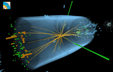
Three dimensional ways of visualization scientific data is nothing completely new though, as are for instance the 3D visuals of particle accelerator results, just recently becoming more famous due to the discovery of the Higgis Bossom.  


Computer visualization of particle debris from the decay of the Higgs boson


In that case though, the visuals refer more to the actual movement of particles, than translating or interpreting numerical data in a more understanding and meaningful way. Still, it is a beautiful and stunning visualization style that could also be used for many different applications.


Some big data solution providers, such as TerraEchos, FMS and Mindtel are already using state of the art 3D technology for big data visulizations. Achieved with the augemnted reality tool zSpace, data becomes a immersive, interactive and physically touchable. "While 3D capabilities are still advancing — the potential to use these types of technologies as a way to discover valuable organizational trends is certainly within reach." - Dave Chavez, 11.09.12, WIRED Magazine 


ZSpace promotional Video


References

Sadowa.tumblr.com (2012) The Reviewer Library (A computer visualization depicts one array of...). [online] Available at: http://sadowa.tumblr.com/post/26485355751/a-computer-visualization-depicts-one-array-of [Accessed: 14 Nov 2012].

Ted.com (2010) David McCandless: The beauty of data visualization | Video on TED.com. [online] Available at: http://www.ted.com/talks/david_mccandless_the_beauty_of_data_visualization.html [Accessed: 29 Nov 2012].

Wired.com (2012) Is 3D Visualization the Next Step For Big Data? | Innovation Insights | Wired.com. [online] Available at: http://www.wired.com/insights/2012/11/3d-visualization-big-data/ [Accessed: 14 Nov 2012].
Zspace.com (2012) zSpace - revolutionary virtual-holographic computing. [online] Available at: http://zspace.com/ [Accessed: 14 Nov 2012].